What we did
- TOP
- Some examples
- Design and Publication of Two Books on Women in Politics
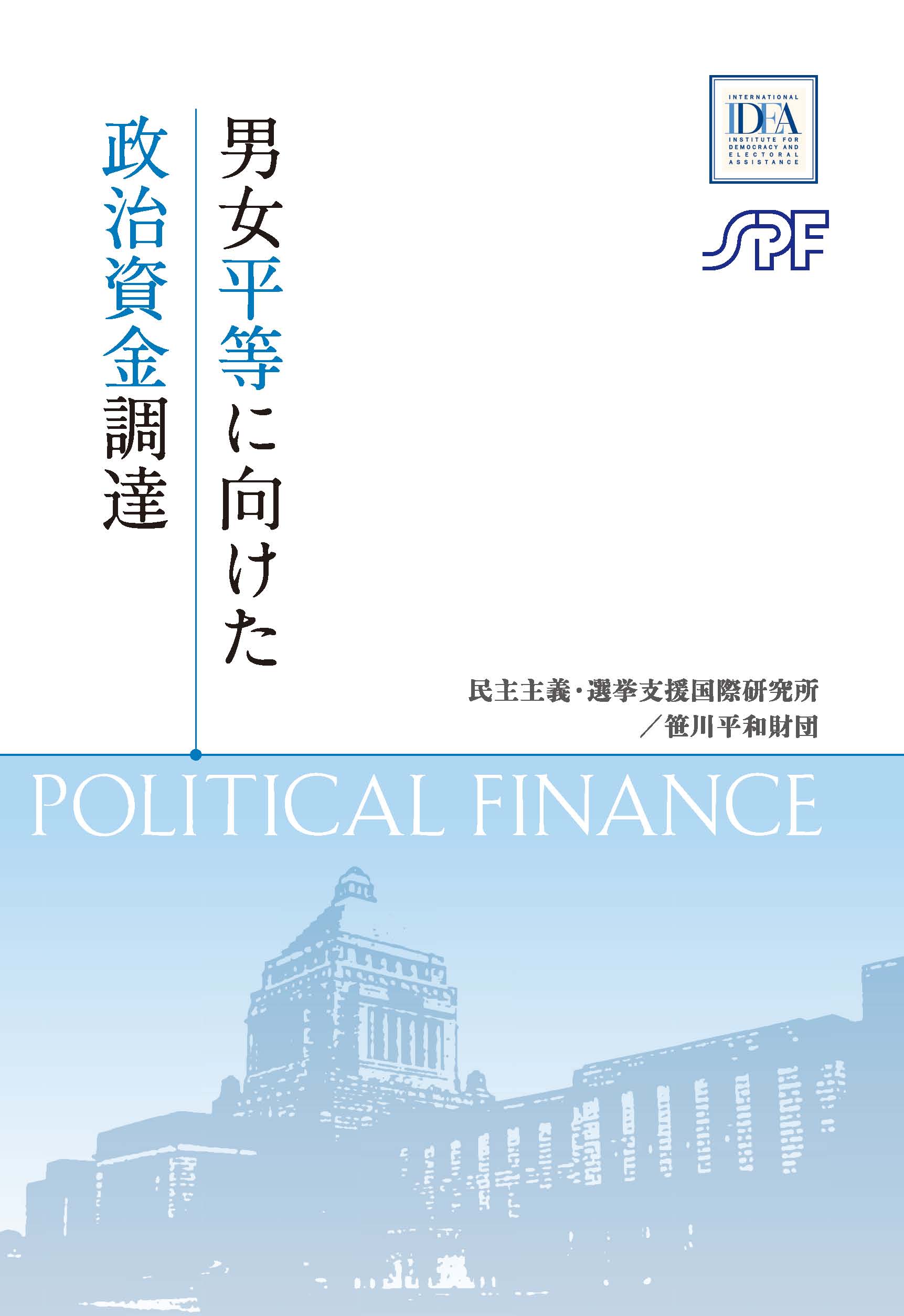
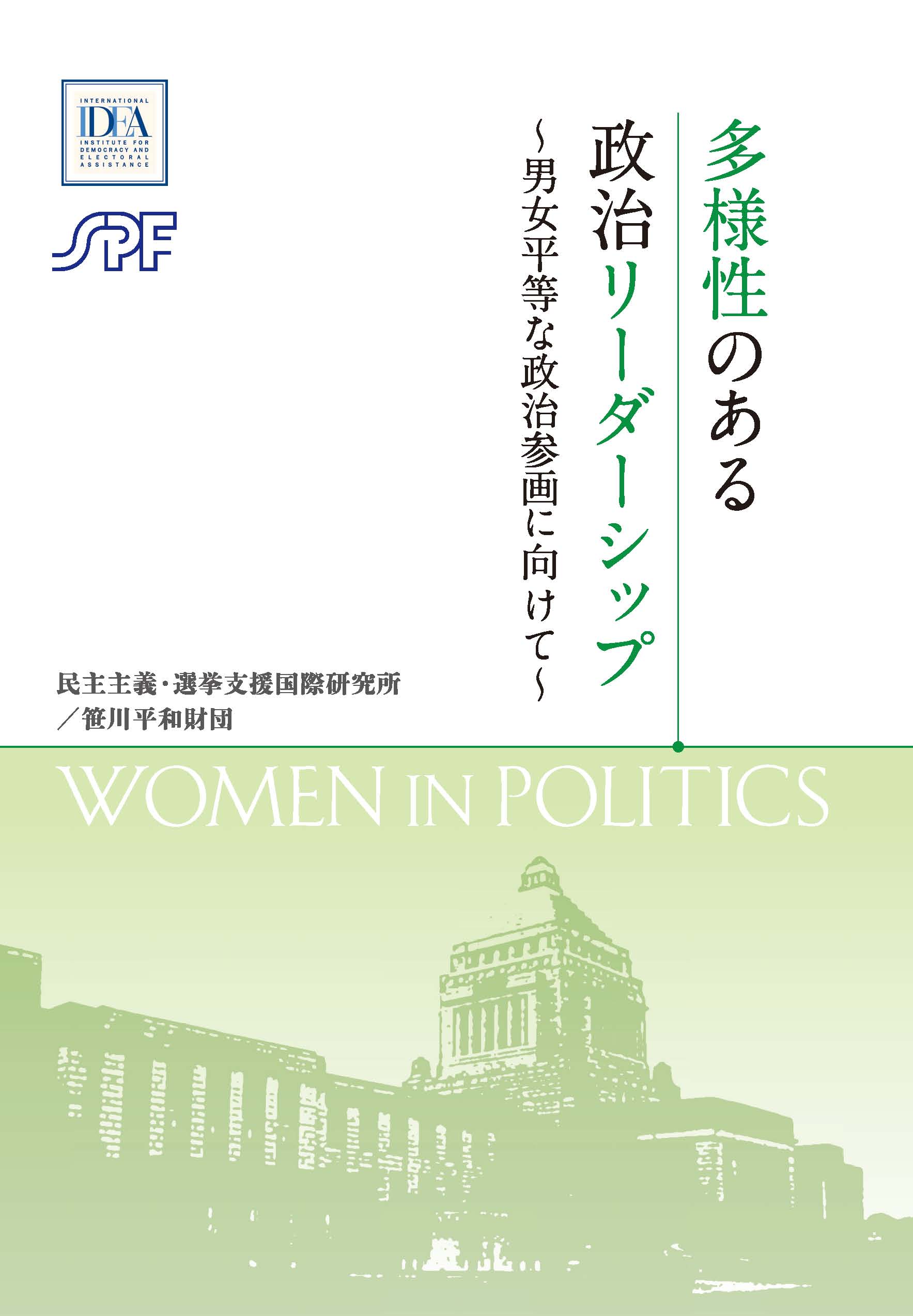
Design and Publication of Two Books on Women in Politics
ClientThe Sasakawa Peace Foundation
February-March 2016
The Sasakawa Peace Foundation (SPF) aims to solve the issues faced by the global community through activities that include research, surveys, human resources development, and the holding of international conferences. It is one of the few think tanks in Japan. Urban Connections is proud to have assisted SPF in creating two publications.
Putting together All the Details
In February 2016 we received a call from SPF about putting together two books. We asked about the details but the only thing decided at that point was the content and the number of copies SPF wanted. The size, design, and so on were as yet undetermined. We arranged a meeting with SPF and learned that 200 copies of each were needed and that they were not going to be sold. We also learned more about the target audience and where the book would be distributed. To give SPF some ideas about the shape and size, we brought past publications produced by Urban Connections. Based on our discussions we put together an estimate, printing specifications, and a detailed schedule. (For those interested, we recommended print on demand because of the small number of copies and A5 size for portability. We also proposed getting an ISBN number to give the book greater gravitas.) SPF had reached out to a number of companies but liked our proposal the most, so we won the job.
Making Sure We Get It Right
Once we got the official go-ahead, we visited SPF once more with one of our designers. SPF wanted a design and color scheme that would be suitable for politicians, academics, and researchers, who were the intended audience. SPF also explained that while the books were on women in politics, the design should also encourage male readership. Additionally, the books were on the same theme and the fact that they were a set needed to be immediately obvious to anyone who saw them. We came up with three cover designs, and SPF ultimately chose the design featuring the Japanese Diet building with a baby blue/pale green pairing. Based on that we then finalized the rest of the design, including the formatting and the font. We also came up with a glossary and editing rules, and reviewed both texts for consistency.
Meticulous Project Management
One of the challenges of the project was having to carefully manage a tight schedule. We also had to account for the fact that our counterpart at SPF would be away for an extended period on business, and build flexibility into the schedule to account for any unexpected developments, but we pulled it off and led the project to success.
Urban Connections Was the Right Choice
Seeing the final product with our clients is always rewarding. There's something about it that never gets old. We were especially pleased to receive a message from SPF afterwards telling us that they were glad they chose us to be their partner. We feel the same way and hope to continue to support SPF with its communication needs, doing whatever we can to help SPF make the world a better place.